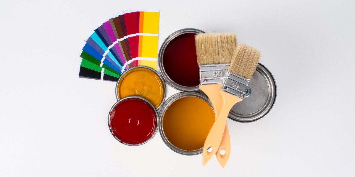

The Color Wheel
The color wheel is a fundamental tool in color theory, helping you see relationships between colors. It consists of primary colors (red, blue, yellow), secondary colors (green, orange, purple), and tertiary colors, which are combinations of primary and secondary colors. Understanding the color wheel allows you to create harmonious color schemes, such as complementary and analogous combinations, that can add depth and interest to your interiors. Complementary colors, which are opposite each other on the wheel, can create vibrant contrasts, while analogous colors, which sit next to each other, offer a more harmonious and cohesive look.
Color Harmonies
Color harmonies are combinations that are pleasing to the eye. These include monochromatic schemes, which use variations in lightness and saturation of a single color, and triadic schemes, which involve three colors evenly spaced around the wheel. Monochromatic schemes can create a soothing and unified look, perfect for minimalist interiors. Triadic schemes, on the other hand, are bold and energetic, ideal for spaces that need a vibrant touch.
Warm vs. Cool Colors
Warm colors like red, orange, and yellow can make a room feel cozy and intimate, while cool colors like blue, green, and purple tend to be calming and can make a space feel more expansive. Warm colors are often used in social spaces like living rooms and dining areas to encourage interaction. In contrast, cool colors are suited for bedrooms and bathrooms, offering a tranquil retreat from the busy outside world.
Neutrals
Neutrals such as whites, grays, and beiges are versatile and can complement any color scheme. They are perfect for creating a balanced, understated look. Neutrals can serve as a backdrop that allows other design elements to shine or as the main palette for a serene, sophisticated space. They also provide a timeless appeal that can easily adapt to changing trends.
The Impact of Light on Color
Lighting plays a crucial role in how color is perceived. Natural light shows the truest color, while artificial lighting can alter its appearance. Understanding the light sources in your space helps in selecting colors that will look consistent throughout the day. For example, north-facing rooms often have cooler light, which can make colors appear more bluish, while south-facing rooms benefit from warm natural light that can enhance warmer tones.
Choosing Colors for Different Rooms
Each room in your home serves a different purpose, and your color choices should reflect that.
Living Room

Kitchen
Kitchens benefit from bright, clean colors. Whites and grays are popular choices, but adding a splash of color with a bold accent wall or cabinetry can add personality. Consider using cheerful colors like sunny yellow or vibrant teal to energize the space and stimulate appetite. Metallic hues, like stainless steel or copper, can also be incorporated to add a modern and sleek touch. Pair these colors with natural materials like wood or stone for a balanced and inviting kitchen design.
Bedrooms
Bedrooms should be restful retreats. Cool colors like blues and greens can create a soothing environment, while deeper shades like navy or charcoal can add a touch of luxury. Consider soft, muted tones for a calming effect that promotes relaxation and sleep. For a more romantic ambiance, incorporate soft pinks or lilacs. Textures and patterns in bedding and decor can enhance the color scheme, adding depth without overwhelming the senses.
Bathrooms
Light colors can make a small bathroom feel larger. Whites, pastels, or soft grays are excellent choices for creating a fresh and clean look. Consider incorporating reflective surfaces and mirrors to enhance the sense of space and light. If you want to add a touch of luxury, opt for marble or tiles with subtle patterns. Adding splashes of color through accessories like towels or artwork can personalize the space without overpowering it.
Home Office
For a productive workspace, consider colors that stimulate focus without being overwhelming. Light blues, greens, or even a rich burgundy can enhance concentration. Blue is known for boosting productivity and focus, while green provides a restful and calming effect. Burgundy or deep reds can inspire creativity and passion. It is essential to balance these colors with neutrals to avoid distractions, creating a serene and efficient workspace.
Children's Rooms
Children's rooms are an opportunity to explore bolder colors and playful designs. Bright and cheerful colors like primary reds, blues, and yellows can stimulate creativity and imagination. Consider themes or favorite characters to inspire the color palette. As children grow, opt for adaptable designs and colors that can easily transition with their changing tastes and needs. Wall decals and removable wallpaper offer flexibility for future updates.
Tips for Selecting the Right Color
Selecting the right color involves more than just picking a shade you like. Here are some tips to guide you:
Consider Lighting
The appearance of a color can change based on the lighting in a room. Test paint samples on your walls and observe how they look at different times of the day. Natural light will bring out the truest colors, while artificial lighting can cast different hues and shadows. It is crucial to assess how the color interacts with both natural and artificial light sources to ensure it meets your expectations.
Use Color Psychology
Think about the mood you want to create in each room. For example, if you want a calming effect in your bedroom, opt for cool tones like blue or green. Use warm colors in social areas to encourage conversation and interaction. Understanding the psychological effects of color can help you create spaces that support your lifestyle and emotional needs, ensuring each room serves its intended purpose.
Test Paint Samples
Before committing to a color, buy samples and paint swatches on your walls. This will give you a better idea of how the color will look in your space. Testing samples allows you to see how the color changes with different lighting conditions and how it complements your furniture and decor. It is a small investment that can prevent costly mistakes and ensure you are happy with the final result.
Think About Flow
If your home has an open floor plan, consider how colors will flow from one room to another. Choose a cohesive color palette that transitions smoothly. Using a consistent color scheme helps create a sense of continuity and harmony throughout your home. Accent colors can be used to define spaces within an open plan, adding personality and interest while maintaining a unified overall look.
Match Colors to Your Decor
Consider the existing elements in your space, such as furniture, flooring, and artwork, when selecting colors. Your paint should complement these elements to create a cohesive and stylish look. If you have a statement piece, like a colorful rug or artwork, use it as a starting point for your color palette. This ensures that all elements work together harmoniously, enhancing the overall aesthetic.
Popular Interior Color Schemes in Kennesaw

Certain colors and trends are particularly popular among Kennesaw homeowners. Here are some schemes to inspire your interior painting Kennesaw project:
Earthy Tones
Earthy tones like terracotta, olive green, and warm beige bring a touch of nature indoors, creating a cozy and grounded atmosphere. These colors are inspired by natural landscapes and materials, offering a calming and welcoming vibe. Pairing earthy tones with natural textures like wood and stone enhances their warmth and creates a serene environment. These colors are versatile and can be used in various rooms to create a cohesive and inviting home.
Classic Whites
White is timeless and versatile, providing a clean backdrop that highlights architectural details and furnishings. It creates a sense of space and brightness, making rooms feel larger and more open. White walls offer a blank canvas that allows you to change decor and accessories easily without clashing with the existing color scheme. Accents in contrasting colors or metallics can add interest and sophistication to an all-white space.
Bold Accents
Incorporating bold colors like deep blue or vibrant mustard as accents can add interest without overwhelming the space. Accent walls, furniture, or decor items in bold colors can become focal points in a room, drawing attention and adding personality. These colors can be used sparingly to create a dynamic look, balancing them with neutrals or softer hues to maintain harmony. Bold accents can also be updated periodically to refresh the space and keep it looking current.
Soft Pastels
Soft pastels such as blush pink, pale lavender, and mint green offer a delicate and soothing palette. These colors are perfect for creating a gentle and relaxing atmosphere, ideal for bedrooms and living areas. Pastels can be layered with neutrals or deeper shades to add dimension and interest. They work well in combination with natural materials, like linen and wood, to enhance their softness and elegance.
Industrial Grays
Industrial grays, inspired by urban and minimalist aesthetics, provide a sleek and modern backdrop. These shades range from light silvers to deep charcoals, offering versatility for various design styles. Gray serves as a neutral base that allows bold colors or textures to stand out. Pairing grays with metallics and concrete elements can enhance the industrial feel, while adding warm wood tones can balance the coolness of gray.
Working with Professional Painters
Hiring a professional painter can save you time and ensure a high-quality finish. When searching for interior painting Kennesaw, consider the following:
Experience and Reputation
Look for painters with a proven track record and positive reviews from previous clients. Ask for recommendations from friends or family. Experienced painters will have the skills and knowledge to handle various challenges and deliver a flawless finish. Checking portfolios and references can give you an idea of their style and quality of work, ensuring you choose a reliable professional.
Color Consultation Services
Some residential painting Kennesaw companies offer color consultation services, helping you choose the perfect palette for your home. These services can provide expert advice on color combinations, trends, and how to achieve the desired mood in each room. A consultant can help you visualize the final result and make informed decisions, saving you time and stress. They can also recommend the best paint types and finishes for your needs.
Quality Materials
Ensure the painters use high-quality paints and materials to achieve the best results. Quality paints offer better coverage, durability, and a more vibrant finish. They are less prone to fading, chipping, or peeling, ensuring your walls look fresh and new for longer. Discuss the options with your painter, considering factors like eco-friendliness, sheen, and suitability for different surfaces, to ensure a long-lasting and beautiful outcome.
Cost and Budget
Discuss your budget with potential painters to ensure their services align with your financial constraints. Request detailed quotes, including labor, materials, and any additional costs, to avoid surprises. It's important to balance quality with cost, as cheaper options might lead to subpar results. Investing in a professional service that fits your budget can provide peace of mind and a superior finish.
Project Timeline
Clarify the expected timeline for project completion with your chosen painter. Knowing the schedule helps you plan around the painting process and ensures the work is completed efficiently. A clear timeline can prevent disruptions to your daily routine and allow for a smooth transition once the project is finished. Open communication with your painter about deadlines and expectations can help manage the process effectively.
Conclusion
Choosing the right colors for your Kennesaw home can transform your living space and reflect your personal style. By understanding color basics, considering the purpose of each room, and testing samples, you can create an interior that is both beautiful and functional. Whether you tackle the project yourself or hire professionals, selecting the right colors is a rewarding endeavor that enhances your home's aesthetic and value. Embrace the opportunity to express your personality through color, creating spaces that inspire and comfort you every day.